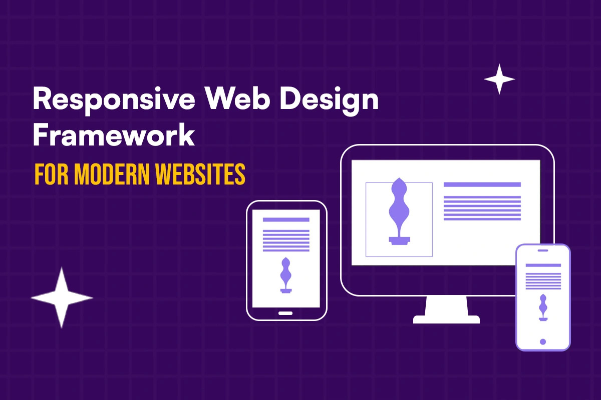
The digital landscape is evolving rapidly, with an increasing emphasis on seamless user experiences across diverse devices. Responsive Web Design framework (RWD) has emerged as a cornerstone for creating websites that adapt effortlessly to different screen sizes.
The Convergence of RWD and React Native
React Native's component-based architecture aligns seamlessly with
the principles of RWD. By breaking down user interfaces into reusable
components, developers can create flexible layouts that respond dynamically to
screen dimensions. This approach not only simplifies the development process
but also enhances performance and maintainability.
Key Benefits of Using React Native
for RWD
- Cross-Platform
Development: Build web and mobile
applications using a single codebase, saving time and resources.
- Performance
Optimization: React Native's focus on
performance ensures smooth and responsive user experiences across devices.
- Rich
Ecosystem: Leverage a vast community and a
wealth of libraries and tools to accelerate development.
- Native-Like
Performance: Achieve near-native performance
through efficient rendering and platform-specific optimizations.
- Rapid
Development: Build complex UIs quickly with
React Native's declarative syntax and hot reloading.
Overcoming Challenges
While React Native offers significant advantages, addressing
certain challenges is crucial for successful RWD implementation:
- Layout
Complexity: Handling complex layouts across
different screen sizes requires careful planning and design
considerations.
- Performance
Optimization: Prioritize performance
optimization techniques to ensure smooth interactions on various devices.
- Testing: Thoroughly test your application on different devices and
screen sizes to identify and fix potential issues.
Best Practices for RWD with React
Native
- Mobile-First
Approach: Design for smaller screens first
and progressively enhance for larger devices.
- Use
Responsive Grid Systems: Employ
flexible grid systems to structure your layouts effectively.
- Optimize
Images: Deliver appropriate image sizes
based on screen resolution to improve performance.
- Test Thoroughly: Conduct comprehensive testing on various devices and screen sizes to ensure optimal user experiences.
Conclusion
By combining the power of React Native with RWD principles,
developers can create exceptional user experiences across a wide range of
devices. As the digital landscape continues to evolve, the synergy between
these technologies will be instrumental in shaping the future of web
development.
Comments
Post a Comment